
Showing posts with label Research/Planning. Show all posts
Showing posts with label Research/Planning. Show all posts
Saturday, 6 March 2010

Tuesday, 2 March 2010
Double page spread layout plan

The picture will be one of the pictures taken for my front cover, as the front cover picture is directly linked to this page. It will, like the cover one, be expressionless. I plan to have a brief synopsis of the artist to the left of his face in order to fill the gap. I will put a small background square behind each word as I have seen done in other double page spreads. I also plan to slightly distort to border between the picture and the interview, I will do this in a box-like style to retain consistency within the page. The picture will be in black and white like the one on the MCR page, and the page will be primarily black, with white and red text (mainly white).
Thursday, 25 February 2010
Double page spread analysis

A double page spread is unlike a front cover or contents page in the way that there are no huge conventional rules when it comes to creating one. There are many in every magazine, all of which are different to prevent the magazine from becoming repetitively boring. Therefor, in every genre there are many, many different ways to construct a double page spread. For example a Hip-Hop magazine may have a very variable structure when it comes to laying out a spread, but the base conventions remain constant, such as typography, colour etc...
Of the unlimited layouts and styles that can be used, I like the one shown above taken from a rock magazine. If i were to apply Hip-Hop conventions to this style I could use it in my Hip-Hop magazine.
In the above example, we see a black and white picture dominating the left side of the page, the picture shows an artist at work, creating a sense of realism. On the right we see white text on a black background. This contains an interview with the band, it is written in small neat typography and in small neat paragraphs.
I like the use of a separated box in the top left, I think it is a good place to put any additional information.
The banner the spans over both pages is an idea I would like to adapt into the conventional Hip-Hop style. I like the way in which colours and fonts are mixed to create an eye catching effect.
The background contain no gradient effect of any kind and is just plain. I like this as it makes the text clearer the read.
When i create my own double page spread I will use many of these ideas but I will adapt and develop them to fit the Hip-Hop genre. For example, I will use a close up of an expressionless face or and I will use smooth and strong typography, as well as the distorted typography I have used on my front cover.
I will not use multiple pictures on one page as the above example has done but I will use a single picture on the left with a more close up shot. I will use the space that in the above example is pictures on the right to hold my interview.
The long box on the right is another idea I will not use. In the above example the white contrasts the black, making it stand out and act as a place for related information. I like this idea as it not only make the page look more professional but it also makes good use of space. I however, will use this space for my interview.
Tuesday, 23 February 2010
Contents re-draft plan
I think that my contents draft has not achieved what I was originally trying to do in merging Hip-Hop and Indie conventions. I think that many features are too large and I have left too much empty space in areas. I also think that the page is too bright, and while this may be conventional of Indie contents pages, it is not of Hip-Hop ones. I plan to make the page darker and add some new features, whilst making the existing ones smaller.
Wednesday, 17 February 2010

Monday, 15 February 2010
Contents page pictures

I have used poses that will allow integration with the page and give the appearance that the model exists with the cover lines. I will pick the one that fits my cover lines best. As with the front cover, I have used a plain expression on the face of my model.
Wednesday, 10 February 2010
Contents Picture plan
For my contents picture I will not use a large close up shot of an artist like in a conventional Hip-Hop magazine contents, and I will not use an uncut collection of photos like in an Indie magazine contents. Instead I will use my own idea. I will use a full body shot of my artist that will be cut out and placed on the right of the page, the picture will interact with the page as I will make it seem as though his foot is resting on a related cover line. I will however, retain the Hip-Hop convention of using an expressionless face and have the model dressed in casual cloths, to match the casual, Indie like style of the page.
Saturday, 6 February 2010
Contents - Single Page layout
As I have failed to find any Hip-Hop contents pages that stick to a single page, and as I and my audience would rather a single paged contents, I have to look at layouts from another genre. I am able to create to contents typography and arrange the colour in a conventional Hip-Hop style due to my research on front covers and other Hip-Hop contents pages, so I do not need to look at any of these things. But to create a layout I must take ideas from another genre. The genre I have chosen look at is Indie as Indie contents pages are usually on a single page and very crowded.


I have looked at many Indie contents pages, two of which are above, and I can see that there are no 'set in stone' conventions of layout. However, every example I looked at had page numbers and a small cover line to accompany them, these were always placed in different areas. They all have a list of artists that are featured in the magazine, usually on the left, and they all have one central picture. In some examples, each section or group of features was in its own little box, giving a tidy looking layout and making the page clearer to navigate through. Some of the examples I looked at had a faded date behind the word 'contents' or a large 'this week' banner. I will take these ideas and utilize them into my magazine whilst following Hip-Hop and my own conventions.


I have looked at many Indie contents pages, two of which are above, and I can see that there are no 'set in stone' conventions of layout. However, every example I looked at had page numbers and a small cover line to accompany them, these were always placed in different areas. They all have a list of artists that are featured in the magazine, usually on the left, and they all have one central picture. In some examples, each section or group of features was in its own little box, giving a tidy looking layout and making the page clearer to navigate through. Some of the examples I looked at had a faded date behind the word 'contents' or a large 'this week' banner. I will take these ideas and utilize them into my magazine whilst following Hip-Hop and my own conventions.
Thursday, 4 February 2010
Contents - single or multi page
After giving it some thought, I don't think that such a bland, multi-page contents fits the magazine I am creating, I think that my magazine would look better with a single and more full contents page, such as an indie contents page, but maintaining the Hip-Hop conventions I have researched. To find out if a potential audience would feel the same way, I asked 20 young males if they would rather have a packed contents page that maintained Hip-Hop conventions or if they would rather a 'Vibe' style multi-page content. Of the 20 I asked, 16 said they would prefer a Packed contents page that maintained conventional Hip-Hop style. So I plan to create a Hip-Hop looking contents on a single page.
Wednesday, 3 February 2010
Hip-Hop Magazine Contents Page

This issue of 'Vibe' magazine contains a generic and conventional Hip-Hop magazine contents page. Like many contents pages in this genre, it contains a very plain background with a smooth colour gradient. The colour used is red, which I have noticed is the most popular colour within Hip-Hop by a clear margin. I will use this colour in my own contents page.
The 'Contents' banner is written in conventional typography, using a clear, bold and smooth looking font in a plain colour, in this case, white.
The banner is written over three lines and placed in the top right, covering much of the area, this broken down effect is common among Hip-Hop contents pages.
The picture used in this instance is of an artist displaying his jewelry and wearing only a a hat in the upper body shot. The picture covers much of the page and is the feature that the audience is immediately drawn to. His expression is plain and shows no obvious emotion, much like pictures on Hip-Hop magazine front covers.
What is unusual about Hip-Hop contents pages, is the way that they display such small and so few features on their contents page, and in a posh looking typography that is nothing like the rest of the typography in the magazine. This usually means that they need to have their contents spread out over several pages.
Wednesday, 20 January 2010
Masthead Ideas
I handed this sheet to 20 young males and asked them which one of the seven mastheads they would prefer to see on the front cover of a monthly Hip-Hop magazine.

The answers are as follows:
So I will be using Masthead 2 on my Magazine front cover.

The answers are as follows:
- 2
- 11
- 0
- 5
- 2
- 0
- 0
So I will be using Masthead 2 on my Magazine front cover.
Monday, 18 January 2010
My Pictures
 I have taken a variety of different pictures in formal clothing. I have tried pictures with and without sunglasses, with and without a suit and tie and with a variety of different poses and angles. However I have tried to stick to the convention of using expressionless faces and bust shots.
Friday, 15 January 2010

Thursday, 14 January 2010
Picture Plan
For my pictures I am going to use a young male as the rest of my magazine is aimed at a young male audience, and most magazines I looked at had young male artists on the front. The model in my picture will be dressed formally in a plain black suit and tie or a shirt and tie, to show sophistication. I have seen formally dressed artists in many other magazines (such as the issue of 'Vibe' with T.I).
The males hair will be spiked, a common haircut among modern people, showing my artist is just like everybody else, and enabling people to relate to him, however I will also render the image black and white to add a mysterious side. I may also use props such as sunglasses, to add the modern look and thus make it more appealing to a younger audience. These will also block out the artists eyes, making him look unreadable. The Sun glasses will be black, thick rimmed and have dark tints, as this is what I have seen on many magazines.
The location of my image in unimportant, as Hip-Hop magazines nearly all use a cut out image on a plain background. I will simply find a plain background to situate my pictures, this will enable me to cut out the image easier.
The males hair will be spiked, a common haircut among modern people, showing my artist is just like everybody else, and enabling people to relate to him, however I will also render the image black and white to add a mysterious side. I may also use props such as sunglasses, to add the modern look and thus make it more appealing to a younger audience. These will also block out the artists eyes, making him look unreadable. The Sun glasses will be black, thick rimmed and have dark tints, as this is what I have seen on many magazines.
The location of my image in unimportant, as Hip-Hop magazines nearly all use a cut out image on a plain background. I will simply find a plain background to situate my pictures, this will enable me to cut out the image easier.
Saturday, 9 January 2010
Hip-Hop magazine closer analysis: Typography/Coverlines

Hip-Hop magazine cover lines are a jumble of size and colour. I think that mixing the size of the typography is very effective as it leads the eyes of the audience to certain parts of the text before others, so the designer can control what is read first. Also, the greater the size of a word the greater emphasis is has. For example, the far right cover line in my example shows a quote from T.I, the name of the artist is written is much larger letters than the text surrounding it, so it will draw attention to itself.
Colour is another great method used by Hip-Hop magazines to determine what parts of the text hold more weight. Any word that is in a different colour to the bulk of the cover line will stand out, helping the magazine control what looks more important.
The font of the Cover lines here is similar to that of the mastheads. The fonts used are bold, strong and smooth.
Other that emphasizing certain aspects of the text, the colour and size combination used by the cover lines makes the entire cover look more interesting and professional.
I will use a large combination of colours and size when creating my own cover lines.

Many Hip-Hop magazines use cover lines above the Masthead. These usually follow the same rules as the other cover lines in the way they use size, font and colour to create a professional look and guide the audience. Lists of features, usually separated by dashes or dots are placed directly at the top, with another, larger line below it. I think this gives the top of the magazine a professional look to it and is a good method of fitting more on a page without cluttering it, and spoiling the conventional tidy look of a Hip-Hop magazine.
I will use cover lines above my masthead to create a more professional look and enable myself to fit more on my cover without cluttering it.
Friday, 8 January 2010
Hip-Hop Magazine closer analysis: Layout/colour

 The conventional layout of Hip-Hop magazine covers is to have a central picture, surrounded with cover lines spaced equally around it. They will usually have one banner-like cover line which much larger than the rest. In the above examples it is 'Eminem' and 'The Game'; and this cover line is nearly always on the left of the cover. The masthead is usually placed behind the head of the model, but still clearly visible and mostly uncovered. above the the masthead we usually see another/more cover lines.
The Background of most Hip-Hop magazine front covers is clear, although 'The Source' (above) uses a kind of texture. The majority, however, use a clear, usually white or black background with a subtle gradient. Usually darker at the bottom and lighter at the top. Sometimes, another very faint gradient can be seen behind the masthead, making the background behind darker and causing the masthead to stand out more.
Hip-Hop magazine covers usually have a colour theme, and as seen in both above examples, this is usually red. They tend to use only one colour, and mix it in with black and white to create a professional and tidy look. The themed colour is usually on the masthead and selected parts of coverlines.
I will take all these factors into account when designing my own magazine.
Tuesday, 5 January 2010
Hip-Hop Magazine closer analysis: Picture


- Hip-Hop magazine pictures are usually close up-medium shots.
- The artist is usually, but not always looking at the camera.
- This artist, with some rare exceptions, will have a black expression on their face.
- The artist is nearly always a male.
- The clothing is usually either formal, like a suit, or very informal, with models wearing only a vest.
- Sometimes the artist is rendered black and white. I think this adds a mysterious effect to the model and also causes then to look modern, as black and white pictures are becoming an increasingly modern and artistic thing.
Saturday, 2 January 2010
Hip-Hop Magazine closer analysis: Masthead

This masthead from ‘Vibe’ magazine is my favorite of them all. I find the strong, bold and smooth typography appealing, eye catching, and fitting to the Hip-Hop genre.
The colours of the Masthead also appeal to me, I like the idea of using a gradient on a masthead. I think the red and black go well together and give the magazine a professional and high-quality edge. This masthead I think would appeal to a young audience as it looks modern and simple, but is designed well.

This masthead from 'The Source' Magazine is the one I like the least. I find the textured look of the typography unappealing and too much like a Rock magazine. The idea of having the 'the' part of the masthead on the left at a vertical position I think is good, but the white border around the edges and the 3D look to the whole thing looks too much like a Rock magazine to me and is unconventional of Hip-Hop mastheads. However I notice that this, like the others, uses the colour red.

This masthead from 'XXL' magazine fits some of the codes and conventions of a Hip-Hop magazine. The font is smooth, strong and bold and the colours are simple. However I dislike this masthead as i find it too simplistic, and i dislike the idea of having a background colour on a Hip-Hop masthead, as to me this seems more like something inspired by an Indie magazine.
I like the colour gradient on the masthead of 'Vibe' and it is something I will use in my own designs.
Friday, 1 January 2010
Looking at different magazine genres
I have been researching different types of magazine genres and how they are composed to decide which genre i will focus on when making my own cover.
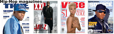
Hip-Hop magazines usually have a large picture in the center. The picture is usually more close up than other magazines, allowing you to see the expressions and body language of the model better. The model usually looks plain faced and stares directly at the reader.
The background behind these pictures is mostly, but not always, plain. The background can always be seen as Hip-hop Magazines usually have a more spacious layout that other magazines. A reason for this is that they do not smother the page in cover lines and smaller pictures. They simply have a few features listed; spaced neatly around the picture that is nearly always central. The typography used in most of these magazines is usually bold and smooth, unlike rock magazines with distorted text or a classical magazine with thin, crisp letters. The masthead of Hip-Hop magazines is similar to its coverlines in the way that it is not distorted, and it is bold. It is usually placed right across the top.
The cover of Hip-Hop magazines usually have a running theme of one or two colours, unlike on many other magazines where the page is a mash-up of different colours. I like this style of front cover as it looks neat and tidy, and appeals to me more than a cover from a Rock or Indie magazine does.
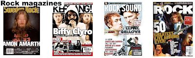
Rock magazines usually have a different kind of picture from Hip-Hop magazines, instead of a single picture placed neatly in the center. They will usually, but not always, follow the convention of having multiple artists in a single shot, and instead of looking plain faced as the Hip-Hop artists do, they will usually look in some way hostile. The background in Rock magazines can not always be seen due to a crowded cover or a large picture, but when they can be seen they are usually dark, adding to the hostility.
Rock magazines usually have one main cover line, and it is usually the name of the artist in the picture. This is usually surrounded by smaller cover lines, all in many different fonts, unlike in Hip-Hop magazines where they usually stick to a few fonts. There is usually no neat arrangement to the cover lines and they are placed randomly throughout the page. The colours of these lines also usually appear random, although they will have a theme, but it is not as obvious as the colour theme presented in Hip-Hop magazines.
The masthead of Rock magazines is usually in a bold and slightly distorted font, and is always placed across the top of the page.

Indie magazines are unlike Rock and Hip-Hop magazines in many aspects of their design. The picture however, is similar to a Rock magazine in its style. Indie pictures usually show more than one artist, but these pictures are also usually slightly smaller than those on rock magazines. The artist's expressions are similar to those on a Hip-Hop magazine, as they usually look blank and show no real emotion, Unlike Rock magazines where we see hostility.
The background is more obscured than Hip-Hop magazines, but less so than rock, so it can usually be seen in small amounts. It is usually light and plain.
Indie magazines will sometimes have one main, large cover line showing a band name, but its is far from a convention. Indie cover line typography is not distorted like in rock magazines, and they usually stick to a set amount of fonts, but not to the same extent as Hip-Hop magazines. The arrangement of the cover lines is also neater than a Rock magazine, as they are usually to the left of the picture. The colours are usually themed, but again, the theme is not as closely followed as it is in a Hip-Hop magazine.
The Masthead of Indie Magazines is usually placed in the top left, unlike in Rock and Hip-Hop magazines where it covers the entire top. A lot of Indie magazines place a background behind their masthead, red is a common colour for this.
Overall, I prefer the Hip-Hop covers, as they appeal more to me as they look neat. I find the Hip-Hop magazine covers to be overall more inviting and appealing, so I will create a Hip-Hop magazine for my task.


Hip-Hop magazines usually have a large picture in the center. The picture is usually more close up than other magazines, allowing you to see the expressions and body language of the model better. The model usually looks plain faced and stares directly at the reader.
The background behind these pictures is mostly, but not always, plain. The background can always be seen as Hip-hop Magazines usually have a more spacious layout that other magazines. A reason for this is that they do not smother the page in cover lines and smaller pictures. They simply have a few features listed; spaced neatly around the picture that is nearly always central. The typography used in most of these magazines is usually bold and smooth, unlike rock magazines with distorted text or a classical magazine with thin, crisp letters. The masthead of Hip-Hop magazines is similar to its coverlines in the way that it is not distorted, and it is bold. It is usually placed right across the top.
The cover of Hip-Hop magazines usually have a running theme of one or two colours, unlike on many other magazines where the page is a mash-up of different colours. I like this style of front cover as it looks neat and tidy, and appeals to me more than a cover from a Rock or Indie magazine does.

Rock magazines usually have a different kind of picture from Hip-Hop magazines, instead of a single picture placed neatly in the center. They will usually, but not always, follow the convention of having multiple artists in a single shot, and instead of looking plain faced as the Hip-Hop artists do, they will usually look in some way hostile. The background in Rock magazines can not always be seen due to a crowded cover or a large picture, but when they can be seen they are usually dark, adding to the hostility.
Rock magazines usually have one main cover line, and it is usually the name of the artist in the picture. This is usually surrounded by smaller cover lines, all in many different fonts, unlike in Hip-Hop magazines where they usually stick to a few fonts. There is usually no neat arrangement to the cover lines and they are placed randomly throughout the page. The colours of these lines also usually appear random, although they will have a theme, but it is not as obvious as the colour theme presented in Hip-Hop magazines.
The masthead of Rock magazines is usually in a bold and slightly distorted font, and is always placed across the top of the page.

Indie magazines are unlike Rock and Hip-Hop magazines in many aspects of their design. The picture however, is similar to a Rock magazine in its style. Indie pictures usually show more than one artist, but these pictures are also usually slightly smaller than those on rock magazines. The artist's expressions are similar to those on a Hip-Hop magazine, as they usually look blank and show no real emotion, Unlike Rock magazines where we see hostility.
The background is more obscured than Hip-Hop magazines, but less so than rock, so it can usually be seen in small amounts. It is usually light and plain.
Indie magazines will sometimes have one main, large cover line showing a band name, but its is far from a convention. Indie cover line typography is not distorted like in rock magazines, and they usually stick to a set amount of fonts, but not to the same extent as Hip-Hop magazines. The arrangement of the cover lines is also neater than a Rock magazine, as they are usually to the left of the picture. The colours are usually themed, but again, the theme is not as closely followed as it is in a Hip-Hop magazine.
The Masthead of Indie Magazines is usually placed in the top left, unlike in Rock and Hip-Hop magazines where it covers the entire top. A lot of Indie magazines place a background behind their masthead, red is a common colour for this.
Overall, I prefer the Hip-Hop covers, as they appeal more to me as they look neat. I find the Hip-Hop magazine covers to be overall more inviting and appealing, so I will create a Hip-Hop magazine for my task.
Subscribe to:
Posts (Atom)